With the cannabis industry being extremely competitive, companies must strive to differentiate themselves and tap into their loyal audience. We’ve discussed a variety of custom packaging in previous blogs. This shows that product packaging is an important part of building your brand image. Your packaging should reflect your target audience and the market segment you are targeting.
Appearance is everything
Many consumer purchases are driven by emotion, and as a brand owner, you need to convey a clear message through your complimentary packaging.
What does the product do?
Who is it for?
Why is your product special?
According to a recent study conducted by the Paper and Packaging Board and IPSOS, 72% of consumers say their purchase decisions are influenced by packaging design. Packaging is important for brand recognition, catching the eye of consumers and creating an emotional connection that says “this brand is for them”.
Make your cannabis products stand out with a packaging design
Whether your products are to be sold in supermarkets, health food stores or specialized dispensaries, you need to make sure they stand out. Trendy designs and eye-catching colors are a great place to start. Look at your competitors’ products.
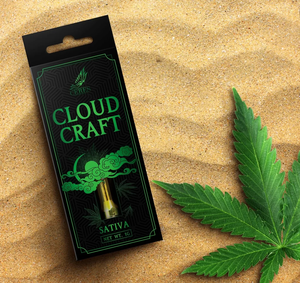
What can you do to make yours stand out?
- Simple and easy to remember graphics and colors
Like Apple‘s easily recognizable logo, their products use bright, bold designs to reflect individual products (e.g. Mac Air; iPhone, Ipad).
Another brand that does a great job with simple colors is Eboost. Their simple green, text-heavy packaging is immediately noticeable on a crowded shelf, which makes the exact meaning of the product immediately apparent. You only have a few seconds to grab attention, and they do a great job of blocking attention from the product as busy shoppers scan the shelves.
- Enjoy the packaging effect of a premium product
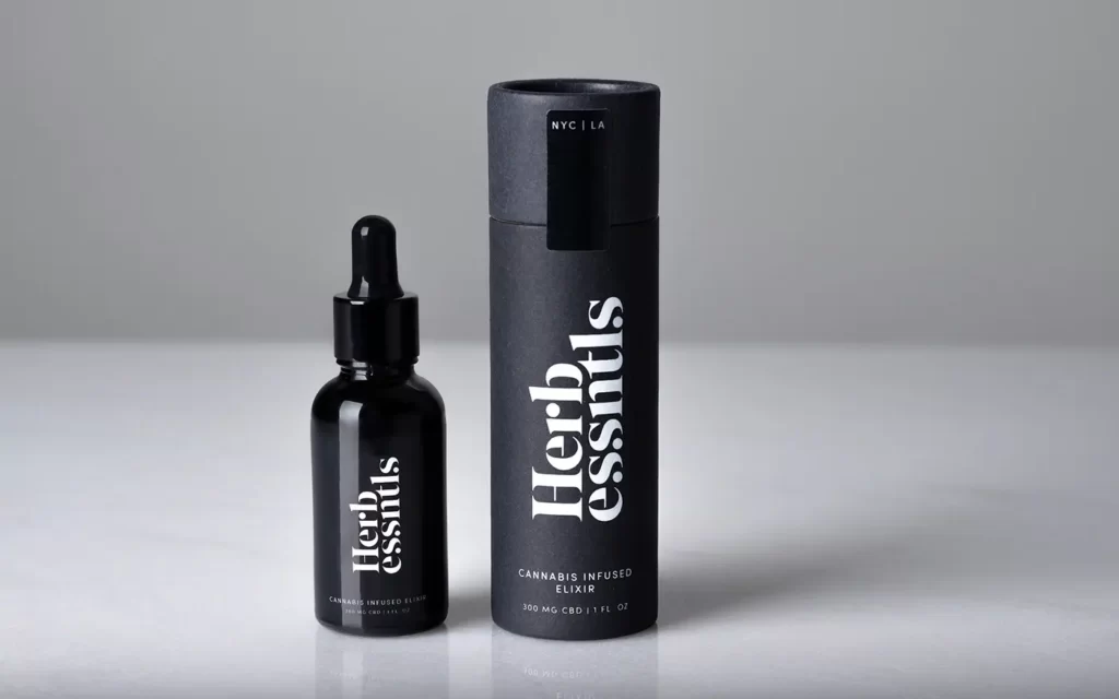
If you’re marketing a premium product, you need to make your packaging look special. Shoppers who spend a dollar or two on an energy bar only want something that tastes good and looks good. People who pay more for a product want an “experience,” and packaging is part of that. Hermes, Bulgari, Rolex are examples. Their packaging is understated and luxurious, with a satisfying feel and embossed foil fonts that give a sense of elegance while increasing brand awareness.
- Unique shapes and forms
Over the years, some companies have tried to use unique shapes as a marketing tool. This can sometimes work well, but sometimes it backfires. Space on store shelves is limited, and premium retail spaces such as the area in front of a POS have been highly sought after. Shelf stackers don’t want to mess with awkwardly shaped bottles, and if your products don’t easily fill the shelves, you may find that you’re not getting as much premium retail space as you’d like.
Whether you sell online or not, creative/unique products and packaging may work in your favor, and you can also try to personalize your products.
- Deliver a clear message
Plan your packaging carefully. It’s the first thing shoppers see, so it makes sense to invest in quality design. Your packaging tells shoppers who you are and whether your product is right for them. Make sure the answer is “yes”.
Top 10 Ways to Increase Sales with Custom Printed Packaging Design
- Test your packaging design
Don’t forget to be patient! It’s a good idea to test your packaging on friends, family and customers before bringing it to market. Not only is this a great way to find anything you may have missed (e.g., typos, missing information), it’s also the perfect way to see if your packaging really speaks to your target audience.
- Thinking outside the box
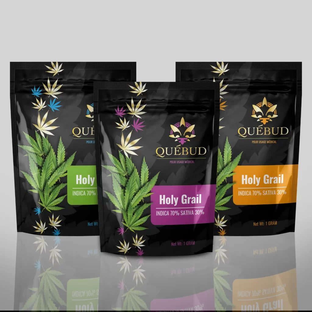
Cardboard boxes can feel old-school – not to mention that they don’t fit certain products. In contrast, die-cut bags are available in a variety of shapes and sizes. They look sleek and modern and even have the added benefit of protecting your products from moisture and oxygen contamination.
When planning your packaging, don’t forget about die-cut bags. They may just add the style you need to get your product off the shelf.
- Use the right colors
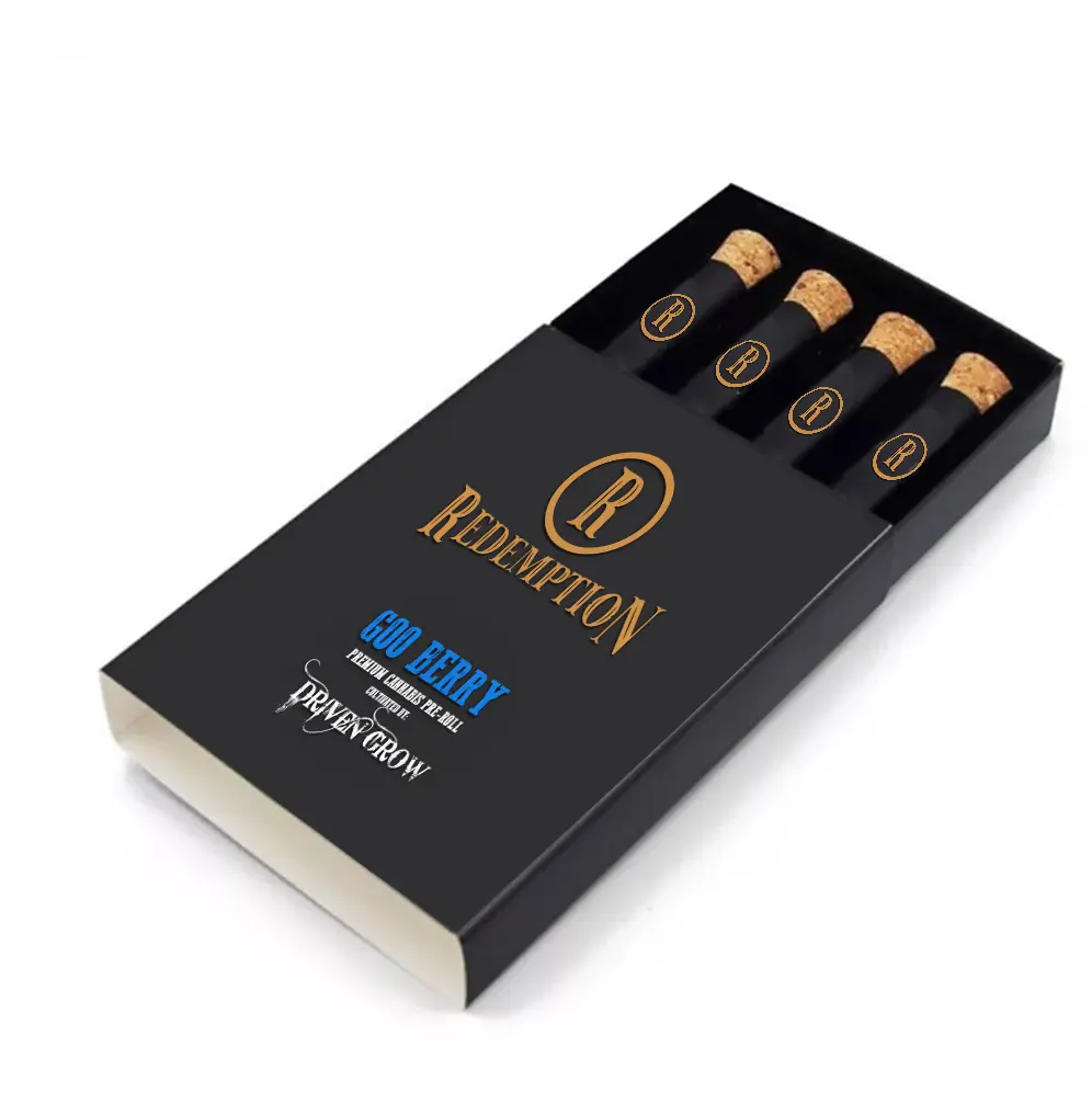
When it comes to package design, perhaps nothing has such a strong impact on consumers as color. If you want to sell a product that promises relaxation, tranquility and reminds buyers of the environment (like cannabis), green is a safe choice; by contrast, if you want to get buyers excited and enthusiastic about a high-energy product (like coffee), bold colors like red may be ideal.
- Choosing the right typeface
Just like color, the typeface you choose for your product packaging can have a huge impact on the success of your package design. Is your product young and trendy or serious and traditional? Choose a typeface that reflects the aesthetic you’ve chosen. And, whatever you do, make sure the font you choose is always the right size and easy to read – no one wants to peek at your sales pitch in the grocery store.
- Avoiding Spills and Damage
If your products are at risk of spilling, damaging or destroying before your customers can enjoy them, take this into account. A good packaging strategy should protect your product from spoilage, oxygen contamination, moisture, etc.; some packaging is even spill-proof, tamper-proof or child-proof to provide further security.
If you care about getting the best possible product to your customers, choose a packaging system that selects protection.
- Don’t forget the shelves and hooks
Think about how your product will be displayed. Does your packaging design need to be freestanding on a shelf or should you choose the best stand-up pouches, or can it be hung on a shelf? In this regard, is it important that your packaging be able to be displayed in both ways? Determining how and where your product will be displayed is important to your packaging design.
- Tapping into customers’ emotions
When people purchase, they do so based on their emotions as well as their eyes. Don’t be afraid to tap into your customers’ emotions and make connections between your products and their own lives.
- Choosing the right packaging for your product
When it comes to designing packaging, the sky is the limit – which means it’s important to sort through the many options to choose the one that works best for you and your product. For example, some cannabis products may benefit from single-serve packaging rather than larger packages, while certain products may be more attractive if sold in eco-friendly packaging. Tailoring the right packaging specifically for your product is essential to help it succeed.
- Function over form
Most importantly, is your packaging functional and practical? Even the coolest, most eye-catching design won’t make any impact if your package won’t stand upright on a shelf, and no one will be able to understand how great your product is if the font is too small.
Choose the right type of zipper or tear opening for your package based on how your customers actually use your product. Is your product ready for a single serving, or will the zipper keep it fresh for products that require multiple servings? Go for functionality and end up with a product that can actually self-market.
- Branding your brand with a new twist
Finally, your package should clearly describe what your product is and what makes it so great. Does your company have a strong philosophy, unique core values or a promise to give back?
You often have just a few seconds to engage potential consumers with a compelling design, well-written product description, and a strong corporate identity and vision. Be sure to showcase all of your content to get consumers excited about you – and keep them coming back for more.
Conclusion
No matter what the product is, it needs packaging. Using good product and packaging differentiation can make all the difference. Visually differentiated packaging will certainly give you the extra boost you are looking for to your brand, and you can transform your product into a digital entity, which will facilitate two-way communication between your brand and its customers, a win-win situation.


